05 July 2012

Different strokes for different...Parliaments

I started this blog in November last year with a post looking at how the disposable income results provided by the tax-transfer system for a single person had deteriorated over the term of the current Government.  This was largely a result of the lack of any tax cuts up to that time.  Now we are in the new financial year (2012-13) and it comes with the first tax cuts of the current Goverment.  It made me think it was worth updating that first post to see to what extent the fall in disposable incomes had been offset by the new settings.

I also thought I'd retain the comparison with earlier governments, and add in an extra one for good measure.  So, in this post I'll include the results for the last 4 governments - Parliaments 40 to 43 inclusive - being the last 2 Howard governments, the Rudd-Gillard goverment, and the still-in-train Gillard government.

As before, this is for a single person who has not taken out private health cover (I want to be able to show the effect of the medicare levy surcharge).

The first chart is a spaghetti effort.  It shows all 4 governments and the percentage change in disposable income over the term of each.  This is measured in current dollar terms (ie, it's CPI adjusted).


(click to enlarge)

It's a bit hard to make out really, but the last Howard government really stands out at both ends of the income range I've covered here.  In contrast his preceding period was quite lackluster.  Let's have a closer look at that one (Parliament 40). 


(click to enlarge)

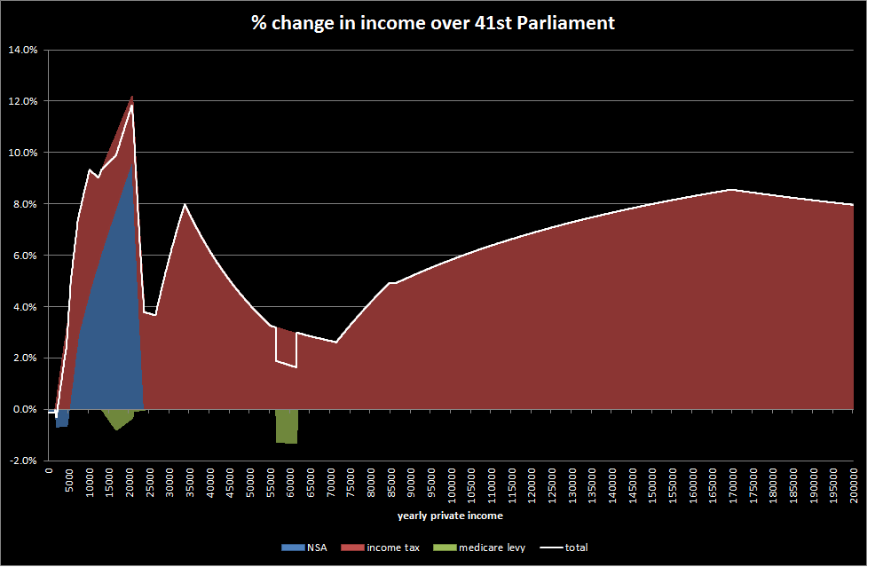
This chart shows the contribution of the individual tax-transfer elements that go to make up the total change - tax, medicare and (at low incomes) Newstart allowance (NSA).  At the low income end we can see that NSA declined in value where it was combined with some level of private income.  This reflects that fact that the NSA income test parameters were not changed during this government and so declined in value in real terms.  There are some tax changes and a bit of medicare movement (the dip at around $60,000 is, like the NSA decline, due to a lack of indexation of the surcharge threshold).  Overall though, the whole thing is easily contained within a 2% up or down band.

In the following term, the brakes seem to have come off...

(click to enlarge)

In this period there were a succession of tax cuts (those on 1 July 2006 were particularly large).  These favoured the higher income end, but there were equally generous (in proportional terms) cuts at around the $35,000 mark.  Interestingly, NSA recipients who had some private income had a significant boost to their incomes as a result of a relaxation of the NSA income test tapers.

The election campaign at the end of this Parliament had the intriguing spectacle of both Labor and the LNP coalition offering very similar tax cuts if elected (Labor's were quite explicitly designed to almost exactly match the LNP proposal).  In the event, Labor was elected and the promised tax cuts were duly delivered.

(click to enlarge)

A couple of things to note here.  The decline in the NSA rate even at zero income is actually a product of the timing of CPI increases to the NSA rate relative to the election dates.  NSA is CPI indexed and so in theory it's maximum value (at zero private income) shouldn't change in this type of chart.  However, the actual date of the increases in rates lags a little and so the rate wobbles around the no-change position rather than nailing it every time.  This is only true of the maximum rates though - the declines where there is also some low private income reflects the lack of any indexation or other changes to the NSA income test.  The other item is the medicare levy surcharge - in this period there was a significant increase in the threshold at which the surcharge applied, with the resultant (green) boost to incomes in the affected income range.

So now to the current government.  After 8 years of quite noticeable increases in incomes in real terms just from the tax-transfer system (ie, ignoring any wages growth or other factors that contribute to household prosperity) we have this:

(click to enlarge)

It's a bit like Howard in Parliament 40, except that it's the higher incomes that have gone backwards rather than the low income end.  There has been a noticeable increase for low income singles due to the combination of clean energy payments and tax cuts, but this has disappeared by $40,000 - the cuts don't make up for the effect of inflation.

On the subject of inflation, it's worth noting that the effects of carbon pricing have yet to appear.  Without other changes to the tax-transfer system, when they do flow through the results above will be pulled down even further.

To me the results to date for Parliament 43 (remembering there's still over a year to go) go some way to explaining the perceptions of a decline in incomes that keeps bubbling away in the media.  Sure, wages growth will override this, and declining interest rates will too.  But not for everyone - those on fixed incomes, and those relying on interest income are not helped.  And even for those who do benefit, they are having to come off a lower - and negative - base compared to the two preceding Parliamentary terms.

I like these forays into comparative Parliaments, so  I may do some more down the track with other household types.  If there's one that interests you let me know in the comments.

Cheers!


30 June 2012

Austudy payment gets a boost

Amidst all the excitement about 1 July and the carbon tax, new tax rates and household compensation one major change seems to have been overlooked.  From tomorrow, students getting Austudy payment (and some getting youth allowance) are going to have a more generous income test, courtesty of a significant increase in the income test free area.  This is the amount of income a person can have before their payment begins to reduce and it will increase from $236 a fortnight to $400 a fortnight.

Students with private income(typically earnings) of $236 a fortnight or less won't benefit from this (although they have had the clean energy advance payment).  Students with income above $236 should notice a change, and in some cases quite a significant one.

The chart below shows the theoretical variation in disposable income caused by the various 1 July 2012 tax-transfer system changes.  It's a vanilla case - a single person without children and without including accomodation cost related charges and entitlements (eg, rent assistance).

(click to enlarge)

The total change in disposable income is represented by the black line.  The coloured bits are there to show the components that make it up.  The increase in Austudy is entirely due to change in the income test free area and provides an increase of up to $2558 a year.  You can see that the tax cuts add a bit more to this. 

The increase in the income test free area means that there's a corresponding increase in the income that can be had before the payment cuts out completely.  People with incomes in this newly extended range can come onto Austudy payment so pick up the clean energy advance, and for many of them, acquire eligibility for the student startup scholarship.  The scholarship (for qualifying tertiary students) gives over $2,000 extra over the course of a year.

Partnered students might get some joy from this change too, provided they are working.  Their situation is complicated by the not-quite-right nature of the partnered income test, as I discussed in this earlier post

So, provided you're a student who has, or can get some work, the Austudy payment changes combined with the carbon tax related measures look like they will provide a welcome boost to incomes!

23 June 2012

Sole parents, public housing and that budget cut

Just before the Federal budget was released I wrote a post discussing one of the many leaks at the time - that some sole parents were going to lose their special parenting payment "grandfathered" status and would have to take up some other entitlement, typically Newstart Allowance.  The main point of the post was that the most substantial losses in disposable income would be experienced by those sole parents who are already working.  As it turns out this was indeed the case, and my calculations of the losses involved seem to have been backed up by DEEWR (I would link to the first article I read that had this, by Patricia Karvelas in The Australian on 2 June - Budget crackdown will penalise single working mums - but it's behind a paywall).

Since then there has been a pretty continuous series of media articles and press releases about the issue as the various lobby groups and concerned individuals agitate for a change.  One that caught my eye last week was by Stephanie Peatling.  It referred to findings that sole parents in public housing would be particularly badly affected.  So, let's look at that proposition.

For those who don't like reading more than a few paras, I'll cut to the chase:
  • Sole parents in public housing will typically not have as large a loss in disposable income as other sole parents
  • The grandfathering arrangement that some sole parents have, and for which there is pressure to retain, actually causes them to pay higher public housing rentals.
  • The return on working for these sole parents in public housing is worse than it will be for those on Newstart allowance in public housing over large income ranges (but better over others).
  • Sole parents in public housing who suffer an income loss as a result of the change will find it harder to make up that loss than those who are in private rental or are home-owners.
That is indeed a mixed bag of results!  So now I'll try and explain how this happens (or at least, my understanding of it).

First, the reduction in disposable income - why is it not as high in public housing?  The answer to this is actually buried in the Stephanie Peatling article.  Public housing rents are based on how much income a person has.  The more income you have, the higher the rent (up to the point where the rent equals the market rental for the property).  The opposite is also true: the less income you have, the less rent you pay.  So, if the change to the sole parent rules means that those affected have less income (and it certainly does), the rent they pay will fall.  That rent adjustment is not something that's going to happen to sole parents in private rental, or other accomodation.

Here's a picture of the difference in incomes between a sole parent on parenting payment and one on Newstart allowance in private rental (assumes $300 a week rent)

Chart 1


(click to enlarge)


Note: CEA means Clean Energy Advance; IS means income support.

You can see the reduction maxing out at about $6,000 a year where private income is around $22K.  Contrast this with the same family type in NSW public housing.

Chart 2


(click to enlarge)

Notice that although the amounts showing as reductions are the same in both charts, the public housing case has an extra item - the housing rebate - which is partially offsetting those reductions.  In fact, at the point where losses were greatest in Chart 1, the reduction in rent caused by the larger housing rebate has pared the reduction back to a little under $5,000 a year.  This is still a big reduction, but is substantially less than the $6,000 experienced by private renters.

The second issue I'll look at is the financial return sole parents in public housing get from working.  This is determined by a few things, but substantially by the effective tax rates in play when a person increases their private income.  We can broaden the concept of effective tax rates a little to include the change in public housing rental, and the result is shown in the following charts.  These represent the effective tax rate on a marginal change in income (the concept is typically expressed as the impact on the next dollar of income) and are EMTR charts.

First, the EMTR faced by a NSA recipient in NSW public housing (note that the NSA income test is the one that will apply to sole parents when the grandfathering arrangements for parenting payment are abolished).

Chart 3


You can see from the above that the increase in rent as private income rises is a significant addition to the EMTR othewise applying.  The substantial kick up at around $34K marks the point at which the NSW system begins to transition a person from paying (broadly) 25% of their income in rent, to 30%.  Those arrangements have the EMTR exceeding 90% from roughly $42K to $44K of private income.

However, things look worse still for parenting payment sole parents...

Chart 4

(click to enlarge)

Notable here is that the income range over which an EMTR of greater than 90% applies is much longer for the PP recipient than for NSA.  Overall, it appears that the EMTRs are worse for NSA at incomes below about $22,000, but worse for PP above that, at least in the NSW housing situation.

Both the NSA and PP results have higher EMTRs as a result of the public housing impacts than private renters or homeowners.  This is particularly significant in the context of the apparent purpose of the policy change - to increase workforce participation.   My earlier post on this subject had a chart which showed how much extra income a sole parent affected by the changed rules would have to earn in order to return to the same level of disposable income they had pre-change.  For those already working it was a substantial increase in working hours.  The higher EMTRs in public housing make this difficult undertaking even more problematic.  My final chart has the extra earnings required to return to the pre-change position for our NSW public housing sole parent.

Chart 5

(click to enlarge)

This is a stunning result, particularly if you consider that the people affected by this change are already required to be working at least 15 hours a week.  So, if we assume that a person is doing that (and I understand that many, if not most, are) and is getting the minimum wage they will be earning around $12,500 a year.  They will need to pretty much double their working hours to stay in the same place, financially.  But worse by a long way is the person earning around $25K (at the minimum wage, around 30 hours a week).  They need to earn another $21K to make up for the (slightly under) $5,000 they have lost.  That's another 25 to 26 hours a week - a total working week of around 55 hours is needed just to tread water!

To sum up, for sole parents in public housing, the budget change is not as bad as it is for those in private rental, unless they want to claw back their financial loss.  Then it's much tougher.

09 June 2012

Taking it out of neutral

There's an OECD report I peek at occasionally that concerns itself with the neutrality of the tax transfer systems across the various OECD countries (it's here if you want to look at it).   The neutrality they are referring to relates to the way the tax-transfer system treats couples, or more specifically, the difference in financial outcomes between couples with the same household income but different distributions of that income across the couple (eg, single earner (100:0) versus joint income (50:50) couples).  I must confess, even after reading it quite a few times I'm not really sure what they think is a neutral system.

In earlier posts I've referred to a noticeable shift in the Australian tax-transfer system toward preferencing two-earner couples.  I've illustrated this via charts showing the change in disposable income over the course of the current Government (ie, since the August 2010 elections) for 100:0 and 50:50 couples.  Anyway, the OECD article makes me want to do it again, but using a different charting approach.

Obviously, couples can have rather different distributions of income than just 100:0 and 50:50 which made me think it was worth trying to cover all possible combinations rather than some of the traditional splits.  So, the charts that follow show outcomes in August 2010, March 2012, and the change over this period.

Before getting into them, however, I should mention an assumption that I'm using.  There's a common, and in some ways quite justified, criticism of comparisons between 100:0 couples and 50:50 couples (or other combinations).  In essence it says that these households are not really comparable because of "hidden" or uncounted income that exists in the 100:0 situation.  The 100:0 household has a full-time at home partner who, it's assumed, does the housework and other forms of domestic production, and when not doing that has some hours of leisure time.  In contrast, the 50:50 household has no-one at home and housework, etc, has to be done in out-of-work-hours time (with less leisure).

There's an assumption in this though that's not stated.  It assumes the 50:50 household has two full-time workers.  That isn't necessarily so.  Personally, I find the assumption irritating simply because my own experience when I had young children was, most of the time, for my wife and I to both work part-time at 50% hours.  Our domestic production was the same then as in some other periods where one or the other worked full-time with one of us at home full-time.  At the time we did do some comparisons of the difference in tax-transfer outcomes between our 50:50 and 100:0 arrangements, made a little easier because the only variable that changed was the distribution of hours worked.

So, I'm assuming in the stuff that follows that the members of my couple are equally interchangeable in terms of wage rates, their capabilities around domestic production, and their enjoyment of leisure time.  After all, I'm trying to focus solely on changes in the tax-transfer system - I only want to alter one variable (income distribution).  At 100:0 the couple is one full-time worker and one full-time at home; at 50:50 both are working half time.

With that out of the way, here's how the system looked at the start of the current Government.  It's a childless couple, both aged, say, 30.  The chart will probably perplex all those who look at it, but I'll explain how it works after you've had your initial shock...

Chart 1: Percentage difference in disposable incomes for different allocations of gross income at various levels of household income - August 2010


(click for larger view)

So, how do you read this...thing?  First, the household income (the combined income of the couple) is found along the right hand side.  The distribution of that income is chosen from the bottom axis, which shows what % of the income is in the hands of Partner 1 (or P1).  Where the household income and the percentage allocation intersect there will be a colour.  The scale on the right gives a value for the colour, which is the % by which the income of the couple of your choice varies from the income of a 100:0 couple at that same household income.

For example, at a household income of $70,000, we find that a 50:50 couple is in the light green zone.  Light green tells us that this distribution of income gives 10% to 11% more disposable income(ie, after tax and transfer imposts) than a 100:0 couple would get from $70,000 income.

Where the income is low enough, income support payments (in this case Newstart allowance) have been included.

The picture is symmetrical around the 50:50 vertical line simply because both partners are the same.  It wouldn't be quite so symmetrical at low incomes if, for example, I had made one partner an age pensioner and the other a Newstart recipient.  Maybe later!

We can see from this that households where both have some level of income do better than 100:0 couples.  No surprise there really; the fact that our system favours two income households in this way has long been used by accountants for small business couples to split income in the most favourable way.

So, now for March 2012...

Chart 2: Percentage difference in disposable incomes for different allocations of gross income at various levels of household income - March 2012


(click for larger view)

Here we see that two income couples have hit a purple patch, quite literally.  For example, at combined household incomes from roughly $55,000 to $85,000, a 50:50 couple is 14% to 16% better off in net disposable income terms than their single income equivalents.  This is quite a noticeable shift in the extent to which the tax-transfer system is favouring two income couples.

The last chart simply shows the difference between the two sets of results.  For example, if the gain in 2010 was 5% and is now 8%, the 3 percentage points difference is shown on the chart.  Doing this highlights which income ranges and distribution combinations have done best over the period since 2010.

Chart 3:  Change in percentage points from August 2010 to March 2011


(click for larger view)

From this it seems the biggest winners, at least in percentage terms, are in the middle of my plotted data, from about $35,000 to $55,000, and cover splits from 50:50 out to about 80:20.  I use winners advisedly - much of this gain actually comes from reductions in the incomes of single income couples as a consequence of the removal of the dependent spouse tax offset for this group.

(Incidentally, does anyone else see a brooding creature in the dark red?  A bat perhaps?  I'm reasonably sure that despite what some people say about the blood-sucking tax system, it's not really there!)

These changes are, of course, consistent with the aim of increasing workforce participation of potential second earners.  It will be interesting to see how much further, if at all, this biasing toward two earner households can be pushed in the design of the tax-transfer system.  What is missing in this analysis though, is households with children.  The picture there is likely to be quite different because of the way Family Tax Benefit Part B works.  Perhaps I'll tackle them another time.

Addendum

I forgot to mention that in calculating the change from 2010 to 2012 I converted the 2010 results to current $ values.  And all calculations are my own, which is perhaps a shame as I can't blame anyone else for any errors.
 

02 June 2012

What Fair Work Australia giveth...

This is just a short post prompted by Friday's National Minimum Wage decision by Fair Work Australia.  If you missed it, the minimum wage was increased by $17.10 a week and will be $606.40 a week from July this year.

I'm going to resist the temptation to brag about predicting the increase correctly (in an earlier post I suggested it would be between $8 and $150 a week - spot on as it turns out).  Instead, I thought it would be interesting to look at whether our tax-transfer system allows the increase to actually flow through to its intended recipients.

To cut to the chase, if you are in a household where both the minimum wage and the income support system are in play, you aren't going to get much out of the increase.  Here's a little chart showing a few household types and the percentage of the wage increase they look like retaining after tax-transfer system imposts have had their bite.  They are all full-time workers, by the way.


The "base case" here is a single person.  They get to keep almost 80% of their pay rise.  Interestingly, a single parent who is not in the income support system (eg, those on the post 2006 arrangements for sole parents) keeps a little more than that - around 81%.  Their fellow sole parents who are in the so-called "grandfathered" group (protected from the 2006 changes) do quite a bit worse, keeping around 32% of the wage rise. 

Why do the grandfathered group do so poorly compared to the non-grandfathered sole parents?  Simply because the former are still in the income support system and so are subject to tax imposts and income support withdrawals.

The worst group (of those depicted here at least) is a single income couple without children.  They retain only 16% of the increase.   As I've noted in earlier posts, this group is really in the cross-hairs at the moment!

Just how much jumping for joy there should be after the minimum wage announcement presumably depends on just where each of the estimated 1.3 million affected households is placed in the tax-transfer system.  The effective marginal tax rate (EMTR) they face on the wage increase will determine the net outcome.  However, if there a lot of them exposed to high EMTRs, it might go some way to explaining a question I saw posed in a plaintive Twitter tweet - something to the effect of why doesn't the minimum wage decision get a lot more coverage.

I guess if you get bugger all out of it, there's not much to get excited about.

As an aside, here's an offer.  If you are interested in these results, but I haven't covered a household type you would have liked to have seen, let me know in the comments.  I'll see if I can do one up for you, and post it as a follow up blog item (or maybe append it to this one).  I'm not expecting a rush, given the fairly low numbers who visit here!

ADDENDUM
Matt Cowgill has pointed out that the ACTU covered this issue in their submissions to FWA.  A wider range of households than I covered is here (see para 126 onward), using the tax-transfer parameters as at February 2012.  (This is probably as good a place as any to mention that my figures are at July 2012 - not that they are substantially different, I just failed to include that important bit of information originally!)

04 May 2012

Single parents and the budget leak

This morning's papers (4 May 2012) had coverage of yet another leaked budget measure.  This one was about removing the special arrangements for those remaining recipients of parenting payment whose youngest child is aged at least 8 (for single parents), or 6 (for partnered parents).  These parents are still getting parenting payment and have been since before July 2006 when the current age limits (8 and 6) were introduced.

At the moment this "special" group continues to have the pre-July 2006 age limit of 16 years applied to them.  The significance of the age limit is that parenting payment is not paid unless a parent has a child younger than these cutoff ages.  When the youngest child hits the cutoff age the parent has to apply for some other type of assistance, typically Newstart allowance.  You know - the allowance that's been getting quite a bit of media attention lately because many people consider it's not enough to live on.

For partnered parents it's not much of a change, simply because the partnered rates of parenting payment and Newstart allowance are the same.  For single parents it's a bigger issue because the single rate of parenting payment is rather more than the single rate of Newstart allowance.  For them, moving to Newstart allowance means a reduction in disposable income.  So, let's look first at how much of a reduction is involved.

The newspaper items I read said the change was to start in January, but didn't give a year.  They did say it was supposed to produce around $700 million savings over 4 years, so I've assumed this means January 2013 is the start date.  I don't have a model of how the tax-transfer system might look in January 2013, but I do have a partly completed version for July 2012 and the charts below are taken from that.  (Note that I modified it a bit to take into account the proposed relaxation of the Newstart allowance income test for single parents with a child under 16 that is supposed to apply from January 2013.)

The chart below shows how much disposable income would change if a single-rate parenting payment recipient with one child aged, say, 15 lost entitlement and took up Newstart allowance instead.  It breaks this up into the various components of the tax-transfer system that change as a result.


You can see that at zero private income (in other words, people getting the maximum rate of parenting payment who then move to the maximum rate of Newstart allowance) the reduction in disposable income is a little over $3,000 a year.  However, for those single parents who have earnings the loss increases, peaking at around $5,500 for those earning a little under $22,500.  Most of the reduction in income comes from the difference in income support payments (parenting payment versus Newstart allowance), but there's a considerable contribution from an extra tax liability arising from a loss of access to (what will be) the seniors and pensioner tax offset.  It's a similar deal with the medicare levy.

Now, the media coverage has suggested that one objective of this change is to increase workforce participation.  (It's perhaps unfortunate then that the largest losses go to those who are actually doing just that.)  So, another obvious thing to examine is how much single parents who lose parenting payment would have to increase their earnings to get back to their original disposable incomes.  The next chart shows just that.


Here, the red line shows the gross extra earnings required to regain the former income.  For example, the parent already earning around $22,500 loses around $5,500 (as detailed in chart 1), but to regain that lost $5,500 they have to earn around an additional $11,800.  That's a total wage of around $34,300.  For someone working at the minimum wage, that actually requires more hours than than a full-time job.

As difficult as this may seem, it's actually less onerous (if that's the right word) than what occurs under the current arrangement for these "special" single parents.  Recall that they still have the old rule applying, whereby the transition to Newstart allowance occurs when the youngest child turns 16.  That transition involves moving to a Newstart allowance that is at a slightly lower rate and has a tougher income test than modelled above.  It looks like this:


Under the arrangement that the media reckons is being removed, the age-16 transition can produce losses of over $9,000 a year.  The tougher income test means it's harder to regain lost income, with a worst case of over $15,800 extra earnings needed to retain the same level of disposable income.

These bigger losses are not exclusive to the special group.   Single parents under the "new" rules experience an age 8 transition, which, from January 2013, will have the effects shown in chart 2, and, later, an age 16 transition from the "relaxed" Newstart to the standard flavour.  The final position is as shown in the age 16 chart - it just takes 8 years and two changes to get there, instead of instantly at age 16.  The change outlined by the media effectively makes the special (also known as grandfathered) group subject to a transition equivalent to the age 8 change all single parents who have come on to parenting payment since July 2006 experience.  It's replacing one lump with two.

Of course, the coverage of the leak may have some factual errors, and so the above might be useless speculation.  I guess we'll see on Tuesday.


25 April 2012

Austudy payment and the half-built income test

Over the last few months you'd have been hard-pressed to miss the ongoing discussion about whether the rate of Newstart allowance is too low.  Occasionally those discussions have also referred to the rates of youth allowance and Austudy payment.  I'm going to have a bit of a look at Austudy in this post, mainly because it's about to get a new income test that seems to be a bit...unusual.  Broken, even.  But there's still a link in this to the rate of payment issue, which I'll get to at the end.

First up a background note: with some minor exceptions, the rate of Austudy is lower than Newstart (NSA).  Perhaps to make up for that handicap, Austudy recipients can have more income than NSA recipients before they start to have their payment reduced.  At the moment Austudy recipients have an income test free amount of $236 a fortnight, compared to $62 for NSA.  Under the new income test, this amount will increase to $400 from 1 July, and, unusually for this type of payment, the income test free amount will be indexed each year.

This new arrangement has the potential to make Austudy recipients who earn while studying considerably better off financially than their NSA counterparts.  The message in the design (assuming there is one) seems to be that Austudy recipients should work while studying.

Unfortunately, when it comes to couples where one or both is an Austudy recipient this income test arrangement only half works.  It's a bit hard to explain so I'll show you instead with some charts.

First off, lets look at a couple where one partner is an Austudy recipient and the other gets NSA.  We'll assume the NSA recipient is the one who gets work and the Austudy recipient is ...studying.

Chart 1: NSA & Austudy couple - disposable income 


 Note: CEA refers to the Clean Energy Advance; DI is Disposable Income

You'll notice that the NSA rate decreases as private income increases.  Once NSA has disappeared altogether Austudy starts to reduce.  This reflects a type of income test where the reductions in a couple's payments are done in a specific sequence - first the earner's payment is reduced, then the partner.  Perhaps a little unimaginatively, this is called a sequential income test.

A key element of sequential testing is that a person's payment is not reduced by partner income until that partner has first exhausted their own entitlement. In other words, only income that exceeds the partner's income test cutout amount is taken into account.  At least, that's the theory.

There is a bit of a logical problem here though, which we can see if we consider our couple above at the point where they first claim payments from Centrelink.  Imagine that Partner 1 (who we'll call Randolph) is already working, earning $25,000 a year, and Partner 2 (Angela) is studying and wants to claim Austudy.   Looking at Chart 1, we can see Randolph obviously earns to much to get any NSA, so how do we work out how much of his income should reduce Angela's payment?  The answer is that we assume that a person who isn't on a payment would have had NSA if their income wasn't so high, and so we use the NSA income test cutout even if they have never applied for it.

So far, so good.  The transition from reducing one partner's payment to the next is smooth.

Next, lets look at two Austudy recipients.  Here's their version of Chart 1, cunningly called Chart 2.

Chart 2: Austudy & Austudy couple - disposable income


What new devilry is this?  There's a sudden and substantial fall in income at the point where Randolph, who is working and studying, exits payment due to income.   This happens because from that income point upwards, Randolph is not an Austudy recipient.  And what's the rule for working out how much income should be taken into account for Angela?  Treat Randolph as if he would have been eligible for NSA.  The generosity of the new Austudy test is lost when Randolph exits payment, despite Angela being an Austudy recipient.

Here are the disposable income results from charts 1 and 2 together:

Chart 3: disposable incomes compared


Here you can see that the new test does improve the couple's disposable income compared to the NSA-Austudy result, but falls in a heap at about $27,000.  In this example, Randolph and Angela are better off financially if he keeps his income below the cutout.  If he exceeds it, he needs to earn over $40,000 a year just to get the couple back to where it was.  That's an income range of over $13,000 a year in which the household can be worse off having an increase in income which takes Randolph off Austudy.

The sequential income test, as currently implemented, is only half built.  By falling back to NSA income test cutouts as the "default" position it denies couples the benefit of measures like the income test changes for Austudy.

This is not a criticism of the July change per-se.  The couple problem in sequential income testing has existed since the scheme was introduced in 1995.  However, the substantial increase in the individual income test free area will exacerbate the problem, and indexation will just make it worse.

So, is there some way this links back to my opening claim that this is tied up with NSA rates?  Well, if the NSA rate is increased then, barring some offsetting change elsewhere, the income test cutout for NSA will increase too.  And that means less income will be counted for cases like Angela's when Randolph goes from being an actual Austudy recipient to a person with a notional NSA cutout.

So, even those not on NSA might benefit from an increase in its rate, especially if they are called Angela.

Addendum

When I wrote this post almost 11 months ago now, I was fully expecting that there would be an increase in the partner income free area for Newstart allowance as a result of the implementation of the clean energy supplement.  Perhaps I was channelling a fortune teller though; for some reason I put in the words "...barring some offsetting change elsewhere...".  Well, it seems there has been an offsetting change which means the increase won't occur.  It's outlined in this post.