For ages I’d been playing about with
various ways to try and show the effect of bracket creep in a chart. Over the
last year or so, I’ve settled on one that illustrates the combined effect of
creep and inflation, plus whatever measures have been put place in the
tax-transfer system that add to or subtract from them. I thought the format was
reasonably self-explanatory, but when I use it for charts on Twitter I get more
than the usual number of requests to explain just what I’m trying to show.
So here goes.
First off, what kind of bracket creep am I
talking about? There’s a narrow version of the term which says bracket creep is
what happens when you have a pay increase that puts you into the next tax
bracket. Indeed, the name ‘bracket creep’ gives that impression. But bracket
creep is more than that. It also encompasses the idea that a pay increase that
doesn’t put you into the next bracket will still push you further into your
current one.
Whether your income crosses a threshold or
not, in a progressive tax system like ours a pay increase will mean
proportionally more of your pay goes in tax – your average tax rate increases. (As
an aside, ‘progressive’ in this sense means that the rate progressively rises
as income increases. It’s nothing to do with the term progressive as applied to
people open to change, new ways of doing things or reform, as in “so and so is
a very progressive thinker”.)
Here’s where we need to pause to wrestle
with a question. If a progressive tax system – and in theory, our tax system is one of those
- is designed to increase the proportion of tax one pays as income rises, why
is bracket creep an issue? It’s what’s supposed to happen, right? And if it’s
supposed to happen, if it’s doing what’s intended, then surely bracket creep is
a good thing? Alas, like nearly everything, it’s yes and no.
So, when is it a bad thing? The answer to
that rather depends on your political leanings, but I think it’s a bad thing when creep occurs even when the increase
in your income is less than or equal to the inflation rate. Such an increase is
not a real increase at all. An
increase that matches inflation means that your overall pre-tax income, in real
terms, is unchanged. However, because you’ve now crept further along the tax scale
(maybe even into a new bracket), a greater proportion of your income goes in
tax. That means your after-tax income has fallen in real terms - your standard
of living has reduced.
When I do charts that look at how things
have changed over time for a particular type of household, I almost always
compare households with the same real income. I like to see how things have
changed for identical households, separated only by time. That means adjusting
the first (earlier) household’s private income (usually earnings) to take
account of inflation, as reflected by changes in the Consumer Price Index
(CPI). For example, If I was to compare a household today, earning $50,000 a
year, with one in July 2016 (when the election for the current, 45th
Parliament was held) I would use earnings of around $48,225 for the earlier
household.
So, all this takes us to the beginnings of
my bracket creep chart. Here’s one that uses the ideas above to show how the
income tax paid by a single person household at 20 March 2018 compares to one
on 2 July 2016 (the election date for Parliament 45). All that has changed is
that the private income (eg, earnings), has increased over the period by the
CPI, or in other words, has stayed the same in real terms.
Chart 1

We can see from the chart that bracket
creep means a person earning $50,000 is worse off than their equivalent back in
July 2016 by over $300 a year. For someone earning $200,000 it’s over $1,100.
Focussing just on income tax is too narrow
though. Our hypothetical single person may also be affected by the low-income
tax offset, and where private income is low enough, or non-existent, Newstart
allowance could also be present. There’s also the medicare levy. All these
things are affected by bracket creep.
The bits of the system that are tax-like
(eg, the low-income tax offset and the medicare levy) are affected by bracket
creep in much the same way as income tax. Transfer payments (eg, Newstart
allowance) have creep effects because increases in income cause reductions in
the rate payable under the various income tests applied to transfers. They also
are affected by inflation – if the rate of, for example, Newstart allowance,
was unchanged from July 2016, not only would there be losses caused by bracket
creep, but the actual value of the payment would have fallen as well.
Given this, the obvious next step is to
modify the chart so that it’s showing the effect of creep on a wider range of
federal government tax and transfer items, adjusted for inflation. Chart 2 is
the same single person comparison, but this time taking into account the low-income
tax offset, the medicare levy, and Newstart allowance.
Chart 2

It’s still possible to see the broad
outlines of the original, income-tax-only chart, particularly at higher
incomes, but a lot of new stuff has appeared. The bigger reductions below
$30,000 are the effect of creep/inflation on Newstart allowance and to a lesser
extent the medicare levy low-income arrangements. The bulge between $37,000 and
a bit under $70,000 is the effect on the low-income tax offset. The 3 hanging
spikes are the effect of creep on the medicare levy surcharge.
As it stands, the chart now shows the
result of bracket creep on a more representative range of tax-transfer elements,
where the creep is due to private income increasing at the same rate as
inflation. It also includes the effect of inflation on the value of transfer
payments (in this case Newstart allowance). This is better, but if I was to
leave the chart in this form it would still be somewhat misleading.
Recall that the chart is based on the
effect of wage increases that match inflation, with no other changes. The ‘no other changes’ bit is a problem because
the Government may have taken steps to address creep/inflation over this
period. For example, if all the thresholds and amounts involved were indexed to
the CPI, the losses shown in the chart would be completely offset and the net
result would be that the disposable income of the household would be the same
at the beginning and end of the period, in
real terms.
Accordingly, I need to add another element to
show the effect of tax-transfer changes the Government may have made over the
period. And so to Chart 3
Chart 3
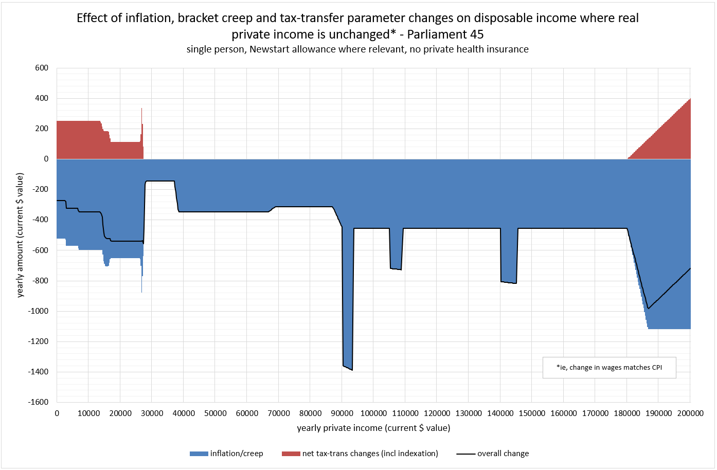
The red areas on the chart show the effect
of the Government’s changes to the tax-transfer system over the period – in this
case since the election of the current Parliament (Parliament 45). Between
approximately $30,000 and $180,000 there have not been any, so the reduction in
disposable income from bracket creep remains as it was in Chart 2.
Above $180,000 there has been some offset to
the creep effect. This is a result of the ending of the budget repair levy, originally
imposed during Parliament 44 and which applied only to those with incomes above
$180,000. Below $30,000 we can see that something happened to offset creep and
inflation, but, as the black ‘overall change’ line shows, only partially. That ‘something’
was the regular inflation adjustments to Newstart allowance. It didn’t
completely offset creep and inflation because these adjustments are not being
applied to the entire Newstart allowance and, more substantially, the
Government also abolished the income support bonus.
These finer details – which bits of the tax
transfer system are affected and by how much – are not discernible from this
type of chart and I didn’t intend that they would be. My intention was for the chart
to show the change in disposable income due to inflation/creep for households whose gross private income
has remained the same in real terms; what further effect (additive or
subtractive) Government changes have made; and the net result.
If you are keen to see charts that have
more detail about what parts of the system changed and by how much, I do have
something along those lines. Chart 4 is an example, which also uses the same single
person household we’ve been looking at.
Chart 4

This gives the same overall result as shown
by the black line in chart 3, broken down by component. There are more of these,
and other charts, on my ‘collection’ post here.
RAVE BY DAVE THE RAVE NO1RAVER NORTHEAST LEGEBND ALL ABOUT RAVE
ReplyDeleteyes alll about rave by dave the rave no1raver northeast legend keeping the rave alive rave heaven
ReplyDelete